App overview
-
Here's what the app look likes:
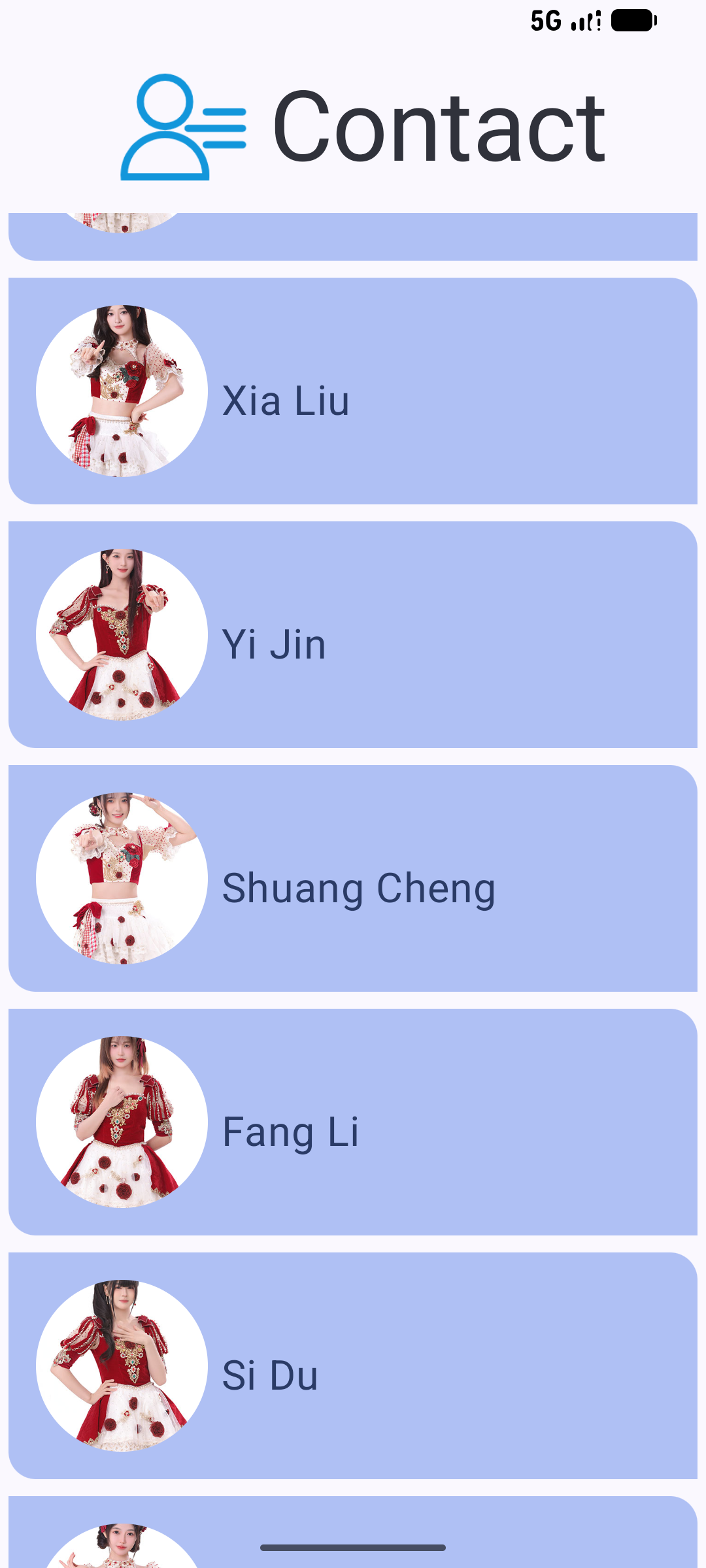
-
Color
-
Color, in the Android system, is represented by a hexadecimal (hex) color value. A hex color code starts with a pound (#) character, and is followed by six letters and/or numbers that represent the red, green, and blue (RGB) components of that color. The first two letters/numbers refer to red, the next two refer to green, and the last two refer to blue.
A color can also include an alpha value—letters and/or numbers—which represents the transparency of the color (#00 is 0% opacity (fully transparent), #FF is 100% opacity (fully opaque)). When included, the alpha value is the first two characters of the hex color code after the pound (#) character. If an alpha value is not included, it is assumed to be #FF, which is 100% opacity (fully opaque).
-
The primary colors are used for key components across the UI.
-
The secondary colors are used for less prominent components in the UI.
-
The tertiary colors are used for contrasting accents that can be used to balance primary and secondary colors or bring heightened attention to an element, such as an input field.
-
The on color elements appear on top of other colors in the palette, and are primarily applied to text, iconography, and strokes. In our color palette, we have an onSurface color, which appears on top of the surface color, and an onPrimary color, which appears on top of the primary color.
Click this link to go to the Material Theme Builder.
-
-
Shape
-
RoundedCornerShape describes a rectangle with rounded corners. The number passed in defines how round the corners are. If RoundedCornerShape(0.dp) is used, the rectangle has no rounded corners; if RoundedCornerShape(50.dp) is used, the corners will be fully circular.
medium = RoundedCornerShape(bottomStart = 16.dp, topEnd = 16.dp)
-
Scaffold
-
A Scaffold is a layout that provides slots for various components and screen elements, such as an Image, Row, or Column.
Scaffold supports the contentWindowInsets parameter which can help to specify insets for the scaffold content. WindowInsets are the parts of your screen where your app can intersect with the system UI, these ones are to be passed to the content slot via the PaddingValues parameters.
 Scaffold(
    topBar = {
        ContactTopAppBar()
    },
    modifier = Modifier.fillMaxSize()) {
        p0 ->
        LazyColumn(contentPadding = p0) {
            items(persons) {
                    p1->
                PersonItem(
                    person = p1,
                    modifier = Modifier.padding(dimensionResource(R.dimen.padding_small))
                )
            }
        }
    }
-
The fun Pic
-
@Composable
fun Pic(
    person: Person,
    modifier: Modifier
) {
    Card(
        colors = CardDefaults.cardColors(
            containerColor = MaterialTheme.colorScheme.primaryContainer,
        ),
        modifier = Modifier
            .padding(5.dp)
    ) {
        Row(
            modifier = modifier
                .fillMaxWidth()
                .padding(0.dp)
        ) {
            Image(
                modifier = modifier
                    .size(dimensionResource(R.dimen.image_size))
                    .padding(0.dp)
                     .clip(MaterialTheme.shapes.small),
                contentScale = ContentScale.Crop,
                painter = painterResource(person.imageResourceId),
                contentDescription = null
            )
            Text(
                text = stringResource(person.nickname),
                fontSize = 24.sp,
                modifier = Modifier.padding(top = 50.dp)
            )
        }
    }
}
-
The fun A
-
@Composable
fun A(){
    Scaffold(
        topBar = {
            ContactTopAppBar()
        },
        modifier = Modifier.fillMaxSize()) {
            p0 ->
        LazyColumn(contentPadding = p0) {
            items(persons) {
                    p1->
                Pic(
                    person = p1,
                    modifier = Modifier.padding(dimensionResource(R.dimen.padding_small))
                )
            }
        }
    }
}
-
MainActivity
-
class MainActivity : ComponentActivity() {
    override fun onCreate(savedInstanceState: Bundle?) {
        super.onCreate(savedInstanceState)
        enableEdgeToEdge()
        setContent {
            ContactTheme {
                Surface(
                    modifier = Modifier.fillMaxSize()
                ) {
                    A()
                }
            }
        }
    }
}
-
The fun ContactTopAppBar
-
@OptIn(ExperimentalMaterial3Api::class)
@Composable
fun ContactTopAppBar(modifier: Modifier = Modifier) {
    CenterAlignedTopAppBar(
        title = {
            Row(
                verticalAlignment = Alignment.CenterVertically
            ) {
                Image(
                    modifier = Modifier
                        .size(dimensionResource(R.dimen.image_size))
                        .padding(dimensionResource(R.dimen.padding_small)),
                    painter = painterResource(R.drawable.contact),
                    contentDescription = null
                )
                Text(
                    text = stringResource(R.string.app_name),
                    style = MaterialTheme.typography.displayLarge
                )
            }
        },
        modifier = modifier
    )
}
-